 Weight of Evidence Based Node Coloring Weight of Evidence Based Node Coloring
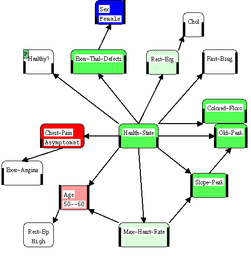
Here we can clearly see that the patients gender provides strong evidence that the patient is healthy while chest pain provides strong evidence and the patients age provides moderate evidence that the patient is sick. The evidence of the resting blood pressure is completely blocked by the evidence provided by the patients age. Note that the scale on the coloring is not fine enough to tell us the relative strength of the gender and the chest pain evidence.
If we wanted to find out more about this patient, we could use this figure to try and select the most informative test. Although "Health-State" is dark green (highly informative), it is not directly observable. The best tests appear to be "Colored-Floro" (cinefloroscopy) and "Exercise Thalium Defects", "Old Peak" and "Slope Peak" all of which are results from a treadmill test. Therefore we must use weight of evidence as a metric for test selection with care, because it does not take advantage of natural groups of tests (Madigan and ALmond [1995] go into this issue in more detail). Furthermore, we must carefully balance the gain from testing against the cost of testing to find tests which are cost effective. To a certain extent, we can do that by using Graphical-Belief to play "what if games" before ordering a test.
While the graph colored with weight of evidence or probabilities does a lot for us, it still is difficult to compare the relative strength of evidence. Furthermore, a subject mater expert (like a physician) may be more comfortable working with a view which hides the graphical model. The Evidence Balance Sheet provides an important alternative representation.
 Continue exploring
explanation using Evidence Balance Sheet.
Continue exploring
explanation using Evidence Balance Sheet.
Explanation Return to the beginning of the explanation examples.