 Probability Based Node Coloring Probability Based Node Coloring
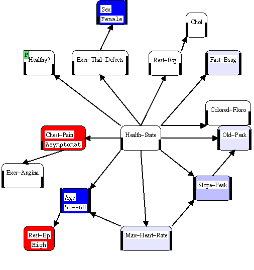
The variable "Health-State" which occupies the central portion of the figure represents the state of coronary artery disease in the patients (note that in the source of this data it was measured by angiogram, an invasive procedure, so this is a model for fairly sick patients). The node "Healthy?" in the upper left hand corner represents a logical restriction of "Health-State" to a yes-no variable indicating the presence of coronary artery disease. The other variables are all observable, either as the result of direct observation or from a test.
The model start with a set of generic data representing the study population (because it is the study population and not the generic population, there is a relatively high baseline risk). We then modify the model to account for observations about a particular patient. In this case we have a 50 to 60 year old woman with High blood pressure and asymptomatic Chest Pain.
In this particular example, the highest risk outcome for each observable value was labeled "Negative" and all others positive. For Health-State, only the complete absence of Coronary Artery Disease was considered Positive. From the picture we can see that the patient's gender and age are positive factors and that the patients blood pressure and asymptomatic chest pain are negative risk factors.
While this picture gives us a good overview of what is happening now, it tells us nothing about the strength of evidence. For example, the resting blood pressure seems to be as strong evidence as the the patient's age, even though observing age completely blocks the influence of blood pressure. To answer questions about strength of evidence, we can color the nodes weight of evidence.
 Continue exploring
explanation using Weight of Evidence Based Node Coloring.
Continue exploring
explanation using Weight of Evidence Based Node Coloring.
Explanation Return to the beginning of the explanation examples.
 Return to
the main example page.
Return to
the main example page.
Back to overview of Graphical-Belief.
 View a list
of Graphical-Belief in publications and downloadable technical
reports.
View a list
of Graphical-Belief in publications and downloadable technical
reports.
 The Graphical-Belief user
interface is implemented in Garnet.
The Graphical-Belief user
interface is implemented in Garnet.
 Get more
information about obtaining Graphical-Belief (and why
it is not generally available).
Get more
information about obtaining Graphical-Belief (and why
it is not generally available).
 get
the home page for Russell Almond , author
of Graphical-Belief.
get
the home page for Russell Almond , author
of Graphical-Belief.
![]() Click
here to get to the home page for Insightful (the company that StatSci
has eventually evolved into).
Click
here to get to the home page for Insightful (the company that StatSci
has eventually evolved into).
The technical report: